OPPO Find 5 Review
by Vivek Gowri on May 29, 2013 6:55 AM EST- Posted in
- Smartphones
- Qualcomm
- Mobile
- APQ8064
- OPPO Find 5
We’re pretty familiar with APQ8064 by now, it’s just quad-core Krait (or Krait 200 in the new Qualcomm branding scheme) and Adreno 320. Five months ago, this was world class, though obviously now outclassed by Snapdragon 600-based handsets. Phones are iterating very quickly nowadays, so it’s hard for any one SoC to stay on top of the market for more than 6 months at a time. Snapdragon S4 Pro devices started hitting shelves in November, and by the end of April, handsets with the next generation Krait were already hitting market. Even now, there are a multitude of quad-A15 handsets as well as Snapdragon 800 right around the corner. Ah yes, the never ending iterative cycle of the smartphone world.
Krait 200 doesn’t count as slow, but it clearly isn’t as fast as Krait 300 on a per-clock basis, and the higher frequencies of the newer Snapdragon parts gives those a solid performance edge. I don’t really have much else to say - this isn’t a new SoC, and we’ve seen it a few times - so I’ll just post the benchmarks. I, like Brian and Anand, am none too thrilled about the state of CPU benchmarks on Android, since they’re all browser-based, but until we get something better, this is what we have to work with.
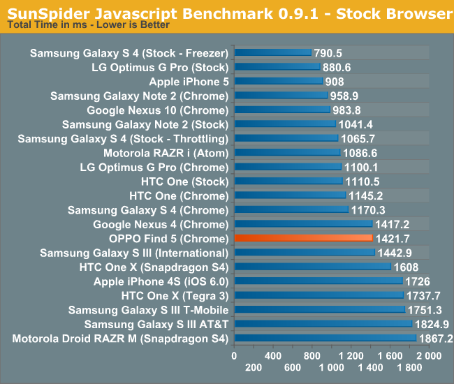
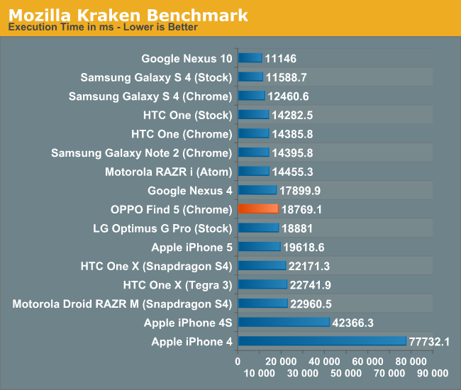
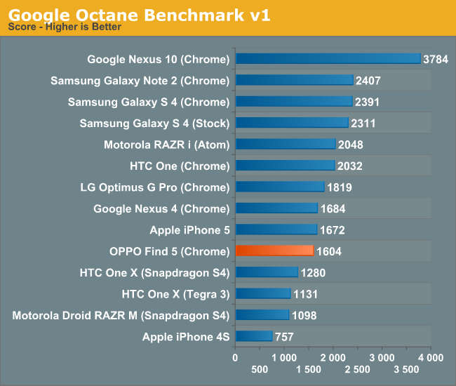
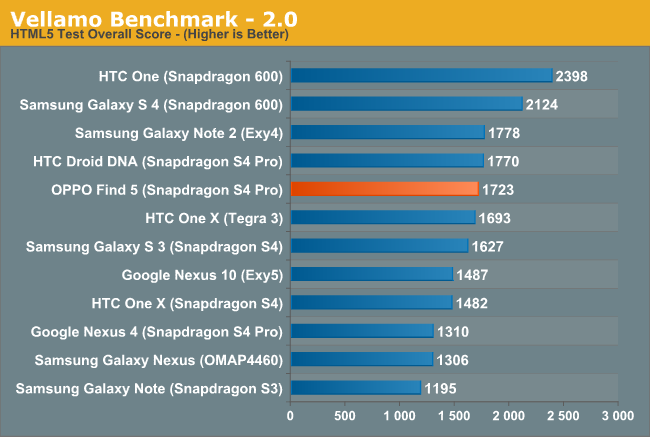
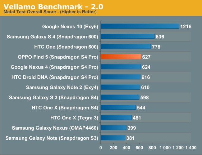
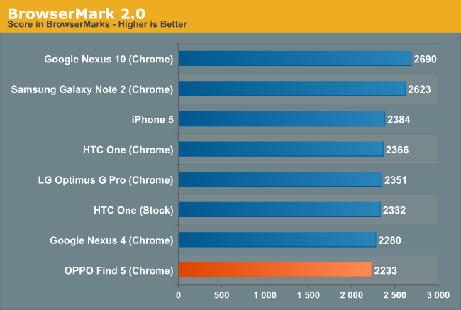
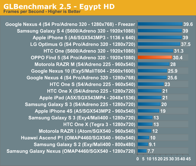
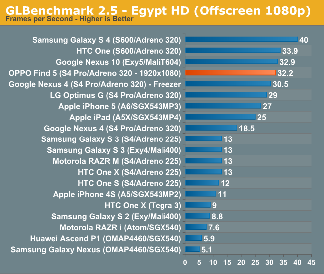
Power management is handled by Qualcomm’s PM8921 PMIC, which we’ve also seen in the Nexus 4, amongst others. The hardware here is actually pretty similar to what we see in the latest Nexus device (other than the display, camera, and baseband, which I’ll get to), which is another potential reason why it’s seen surprisingly quick adoption by third party developers (especially getting official support from Paranoid Android, who usually start with Nexus devices and let others port to more mainstream handsets like the Galaxy S3).
Throttling is becoming a big deal with phones, and it’s important to address it. The throttling thresholds for the OPPO start at 72C, at which point the maximum frequency of the cores drops to 1.18GHz, then 810MHz at 75C, eventually clocking all the way down to 384MHz at 90C. The eventual shutdown is triggered at 120C. I’m not sure what exactly I’d have to do to a phone to get it to 120C other than literally throwing it into a fire, but there you have it. In day to day use, I didn’t see it throttle, even when running benchmarks. I did induce a throttling scenario when using a high-current tablet brick to charge the Find 5 and running GLBenchmark to stress the system, but it’s nowhere near the Galaxy S4 in terms of throttling frequency. I never had a problem with throttling on either of my personal Nexus 4s, though we all know how much trouble Brian had on his evaluation unit, so your mileage may vary here.


39 Comments
View All Comments
Kristian Vättö - Wednesday, May 29, 2013 - link
I agree with you on the button layout. Power button on the side design might be okay if you're right-handed as your thumb can easily reach the button but I can say from experience that it's awful if you're left-handed (like me). Given the size of the current phones, it's very, very hard to securely reach the power button with your left index finger - but I'd have no problems if the button was placed on the top of the device.That said, I know left-handed people are the minority and most designs ignore us, but I'm pretty sure there are scenarios when right-handed people use their phone with their left hand. Or at least I use my Nexus 4 with my right hand by time to time (e.g. while driving).
kondamin - Wednesday, May 29, 2013 - link
Powerbutton on the top of the device or the bottom is the way to do it. I'm constanly chaning the volume when I turn my s3 off because of that moronic idea of putting them on oposing sides.And you are spot on that these devices aren't friendly for left handed people, the biggest sinner in my book is nokia their lumia buttons are all on the same (and wrong) side.
JPForums - Wednesday, May 29, 2013 - link
I'm mostly ambidextrous, but I'm always using my Lumia 920 with my left hand. I have no trouble using it with my right either (just switch to operating the buttons with my thumb), but I find more often than not, I pick it up and operate it with my left hand. On that note, I suspect I'd get used to the OPPO button placement fairly quickly as well (even if it isn't ideal). I'm guessing you don't much care for operating your phone buttons with your fingers. I do agree with you that putting the power and volume rocker on opposite sides is a generically bad idea, though.mr_tawan - Wednesday, May 29, 2013 - link
I'm kinda like the Galaxy Nexus's button layout. In the other hand, button layout on the Nexus 7 sucks. I constantly press volume button instead of power button.I think the power button on the top is good for smaller phone. For a larger phone (>4.6"), it's should be on either left or right side, and on the opposite side of volume buttons). It's too far to reach the top.
WhiteAdam - Wednesday, May 29, 2013 - link
Love my job, since I've been bringing in $82h… I sit at home, music playing while I work in front of my new iMac that I got now that I'm making it online. (Home more information)http://goo.gl/fDMVb
nancy919 - Wednesday, May 29, 2013 - link
it's realy the easiest work Ive had.mwarner1 - Wednesday, May 29, 2013 - link
I actually prefer having buttons on the side of modern, large screened phones. The idea of having the power button on top is fine for a device the size of an iPhone, but when you are taking about devices with 5+ inch displays, it is rather awkward to reach all the way to the top of the device to press the power button.Zandros - Wednesday, May 29, 2013 - link
As a right-handed person, I'm usually holding my phone with my left hand so my dominant hand is free to do other things (which occasionally consists of stabbing at the screen).Maybe I'm missing something, though, but isn't having the power button on the left site (as in this case) advantageous for thumb use if you're using it with your left hand?
Kristian Vättö - Wednesday, May 29, 2013 - link
Oh, you're right - the power button is on the left side in the OPPO. I just looked at the "Finger Friendly Design" picture and thought that it's on the right side like in my Nexus, haha. At least for me, it would advantageous to have the power button on the left instead.Basically, with the OPPO all the right-handed people go through the same pain as I go through with the Nexus 4.
VivekGowri - Wednesday, May 29, 2013 - link
Yeah the OPPO power button is a nightmare. I am not impressed by their so-called finger friendly design.