AnandTech Guide to Better Photos: Post-Processing
by Stephen Caston on March 18, 2005 3:45 PM EST- Posted in
- Digital Camera
Levels
Almost every photo can benefit from a levels adjustment. We are going to show you some examples that demonstrate how a levels adjustment can bring life back into your photos. This is particularly effective for images that are too dark. The levels command in Photoshop and Elements allows you to remap the brightness levels in a photo resulting in a high contrast image.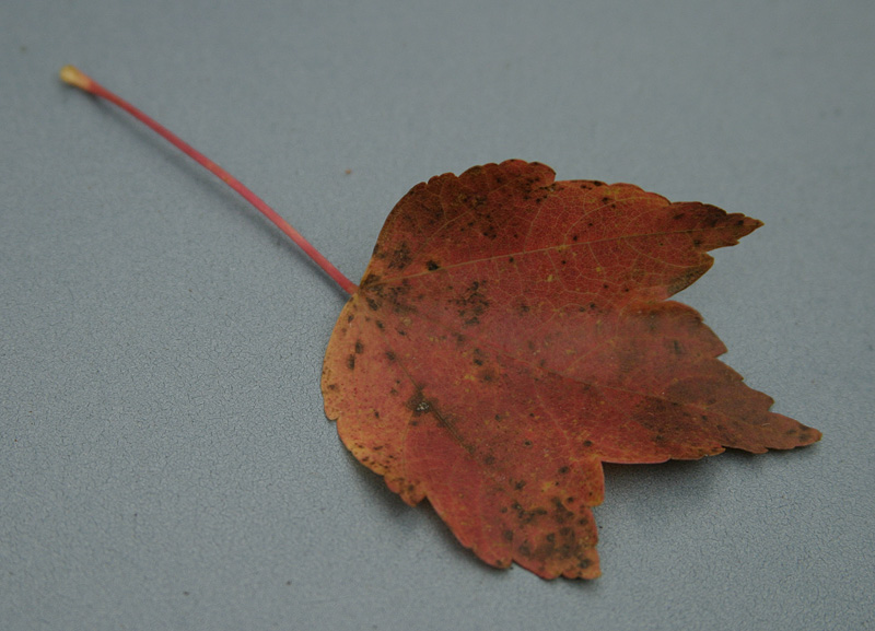
Original image
Click to enlarge.
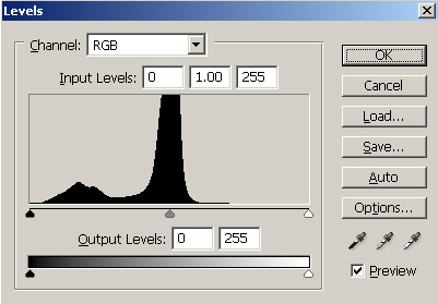
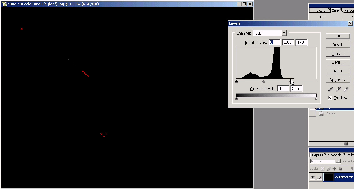
1) Open the Levels dialog by pressing Ctrl-M (Mac: Command-M). Again, you could just as easily use a Levels Adjustment Layer if you think that you might want to alter it later. The first thing that you will see is a histogram. A histogram displays the brightness of an image starting with the darkest information on the left to the brightest information on the right.
2) Click on the black slider on the left directly under the histogram (circled in red below). Slowly drag the slider to the right.
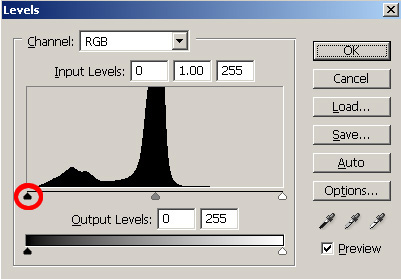
Dragging the black slider to the right while holding “Alt”
Click to enlarge.
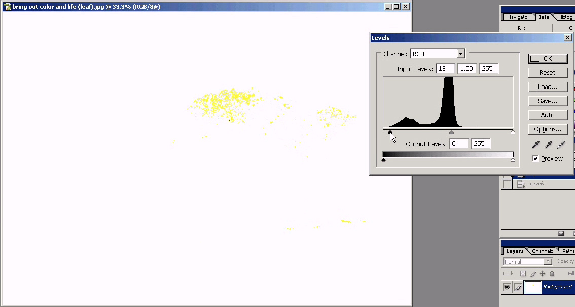
Now, use the same technique to drag the white slider to the left and stop just before clipping any color channels. You should already see a tremendous difference if your photo is anything like ours.
Dragging the white slider to the left while holding “Alt”
Click to enlarge.
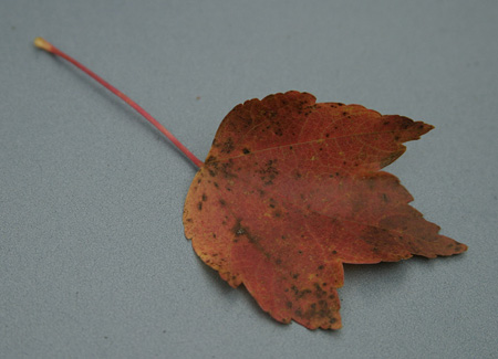
Here are the results that we achieved by simply adjusting the black and white sliders:
| Original image |
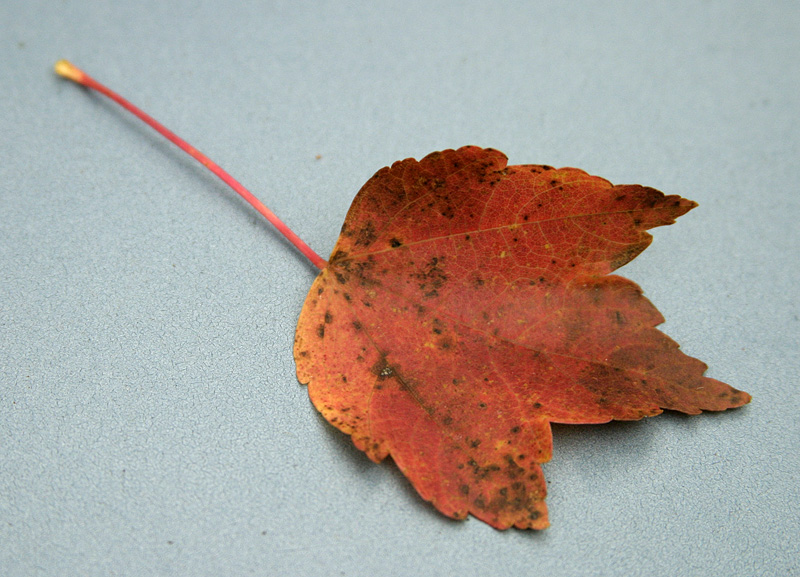 Image after levels adjustment |
| Click on above images to enlarge. | |
 Original histogram |
 Histogram after levels adjustment |
You can clearly see how we’ve “stretched” the histogram to cover more of the brightness range. This has increased the contrast and given the photo more “pop”. Below is a final comparison where we pulled the white slider just a bit further to the left. Although this causes some slight color clipping, it is hardly noticeable and the effect is just what we wanted.
Hold mouse over image.
Hold mouse over image.


20 Comments
View All Comments
Bobby Peru - Thursday, June 23, 2005 - link
Would love it if you'd describe batch processing of photos. With Photoshop or, I think the simplest way is running ImageMagick on Linux or Windows Cygwin. You can just whack a whole folder of 100 photos with one simple command line. The underlying DSP algorithms are basically identical to Photoshops's.buttwhacker - Wednesday, April 13, 2005 - link
good article, very informative and i hope u can add to this article.THEJUICE - Tuesday, March 29, 2005 - link
Useful article and enjoy the series. Thanks.vladik007 - Thursday, March 24, 2005 - link
wouldnt it be better just using selection , feather , and adjusting color channels insidethat selection ?red is usually 100% , so you take it down to 5- 10 % , green and blue are best at 50 % in red channel...
never really liked burn tool for red eye ...
stephencaston - Monday, March 21, 2005 - link
#15,I assure you the original image was not doctored. That would defeat the purpose of post-processing ;-) We've updated the page to include a link to the original file. To get the brush to the right size, use the "[" and "]" keys to increase and decrease the brush size. In our example, the Color Replacement Tool is actually desaturating whatever you paint. So, if you can't get the brush to the exact size, it is best to select a smaller brush and paint around inside the pupil until the red-eye is gone. Good luck!
E Scott Channell - Monday, March 21, 2005 - link
I'm curious how the red-eye sample photograph was obtained... the red-eye region appeared to match the paint-brush shape perfectly... Sometimes getting good results takes a wee bit of fiddling so if this was a doctored "good photo" used for illustration it would provide unreasonable expectations as to what a "quick fix" can achieve.Also, if this is a doctored photo the article should make mention of that.
jeffbui - Sunday, March 20, 2005 - link
Good article as well. An amateur has to start somewhere.Gatak - Sunday, March 20, 2005 - link
Actually. Have you tried to do basic stuff like levels, curves and channel mixer with Gimp? The results are inferior to that of Photoshop, especially when you use 16bit/channel mode.AnandTech, you should do a article where you compare photoediting steps between Photoshop and Gimp.
PrinceGaz - Sunday, March 20, 2005 - link
Nice article if you use Photoshop [Elements]. Did Adobe sponsor this article, Stephen?Everything you told people how to do with Photoshop can be done just as easily with Paintshop Pro, the full version of which costs only slightly more than Photoshop Elements, but isn't a cut down version like Elements is. Unless it came free with the camera, or a scanner, you'd have to be crazy to go the Photoshop route just for tweaking your pictures when much cheaper and equally good options are available.
Even splashing out for Paintshop Pro is probably unnecessary for the vast majority of people who will find everything they need available in the freeware image program 'The Gimp'. It might have been better to assume people were using The Gimp rather than Photoshop, as everyone can download The Gimp free of charge (legally).
unhaiduc - Sunday, March 20, 2005 - link
great article, i read every one of your photo tutorials and loved every bit of it!cant wait for the next one :)