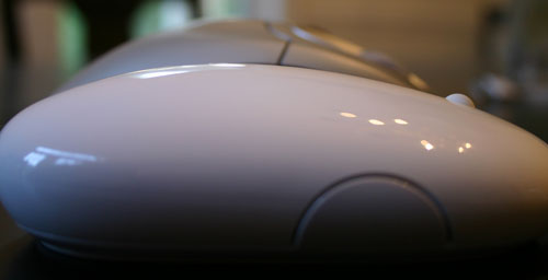
Apple's Mighty Mouse: The Move to Multi-Button
by Anand Lal Shimpi on August 4, 2005 8:10 PM EST- Posted in
- Mac
Aesthetics and Ergonomics
Ergonomically, the Mighty Mouse (and the rest of Apple's mice for that matter) is really a hit or miss depending on the size of your hands. Personally, I've never been too happy with the size of the Logitech MX1000, so moving to a smaller mouse is nice, but at the same time, I don't feel that the design of the Mighty Mouse is particularly ergonomic for resting your hand on it for long periods of time. Then again, quite possibly the most ergonomically sound decision that you can make is to not rest your hand on your mouse for long periods of time.
Logitech MX1000, Microsoft IntelliMouse Explorer 4.0 and the Mighty Mouse

IntelliMouse Explorer 4.0 vs. Mighty Mouse Height Comparison


45 Comments
View All Comments
kelmon - Friday, August 5, 2005 - link
Great article. I'm pretty interested in one of these mice as my current MS IntelliMouse is getting a little long-in-the-tooth and could best be used with my old PC these days. Since I'm going to be in London in a couple of weeks I'll stop in at the Apple Store there and see if I can play with one for a bit. Gaming isn't something that I do very much these days so that aspect shouldn't be a problem, so if it feels comfortable and the scrollball works well for me then I'll probably buy one (assuming that I can persuade the wife...).Anyway, a great summary of the features and it definitely highlights the need to "try before you buy".
jkostans - Friday, August 5, 2005 - link
What I got from this article: The mouse sucks, but we don't want to offend the mac people so we'll be very very nice about saying it. I have no idea why anyone would buy this after seeing this or any other review on the web.jazzcrazed - Friday, August 5, 2005 - link
Well, it's important to know that the prospective users of this mouse are not reserved to users of multi-button mouses, but also users of the one-button Apple Pro Mouse - which are, believe it or not, the majority of Mac users. Us PC users who've all our lives used multi-button mouses most certainly do not know the perspective of someone who's exclusively used one-button mouses. Anand emphasized his subjectivity on this matter, and rightly conceded that in many cases he could not speak universally on certain features. He wasn't writing this review just for PC users, but Apple Pro Mouse+Mac users.For what it's worth, I think it's definitely a more scrutinizing review than <a href="http://arstechnica.com/reviews/hardware/mightymous...">http://arstechnica.com/reviews/hardware/mightymous... Cheng's at Ars Technica</a>.
Griswold - Friday, August 5, 2005 - link
Why is Apple going to extreme lengths to be different and sacrifices usability for that? Are they afraid of being compared to (superior) products and thus hide behind fancy gimmicks nobody really needs or wants?fishbits - Friday, August 5, 2005 - link
I was asking the same thing myself. The basic three-button mouse with scroll wheel works fabulously, and if you can't improve on that or even come close, don't bother. But that's the weird cultish power of Apple. Because it's different it must be better, and because it's Apple it must be better. Even when it isn't.Even Anand falls for it to some degree. Cracked up reading his lapse into battered wife syndrome:
"It's my own fault, I brought it on myself!" A PC user buys a crappy mouse and says "This thing is a piece of junk," throws it out and buys one that works right. An Apple user buys a crappy Mighty Mouse and says "There must be something wrong with ME!" Too funny.
Backslider - Friday, August 5, 2005 - link
My thougths exactly, WHY! Just make it two buttons and be normal. I wonder how much money they spent in engineering this stupid gimicky crap. If I was an investor I would be pulling all my stock out today.Davediego - Friday, August 5, 2005 - link
You mentioned you wished other mice had horizontal scrolling... well your mx1000 does. The scroll wheel titls to the side.Dennis Travis - Friday, August 5, 2005 - link
If you read farther down Anand states his MX1000 has horizontal scrolling.radonX3 - Friday, August 5, 2005 - link
I don't understand the logic of Apple. Everything they make are flashy toys with no real functionality behind it. This mighty mouse is another example of it.Hywel - Monday, August 8, 2005 - link
I think you're wrong here. "Everything they make are flashy toys with no real functionality behind it", is just plain wrong. It's a common accusation that Apple are all form over function, but it just ain't true. The majority of Apple product offer form and function.However, in this particular case, the stupidly named Mighty Mouse, Apple have produced a lemon. For all the reasons the review mentions. For the 'battered wife' syndrome mentioned in a comment below, and probably a whole lot more.
I've been thinking about getting a multi-button mouse for a while, but it's not been a priority. Unlike a lot of Mac people, I think properly designed context sensitive menus are fabulous - as long at they're contextual, and not just a bunch of unrelated crap. So I was ready to jump on this thing. Given two products that are essentially equal, I'd go for the Apple one, even if it was a few quid more. Simply because they usually make good stuff that's easy to use. I'm not buying this thing though. I've thought about it, and I think this review is being a bit soft on Apple. This mouse is over-engineered. It solves a problem of Apple's own invention: "Make a two button mouse with no apparent buttons", when the real job spec should have been "Make a bloody good comfortable multi-button mouse that's better than anything from Logitech or Microsoft".
The mighty mouse is crap.