Apple's Mighty Mouse: The Move to Multi-Button
by Anand Lal Shimpi on August 4, 2005 8:10 PM EST- Posted in
- Mac
Small Balls and Touchy Sensors
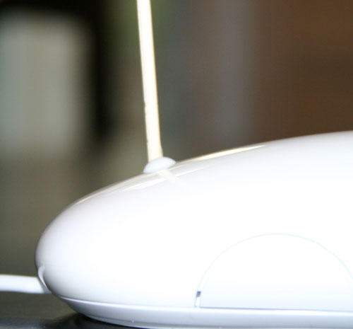
Not only is the Mighty Mouse Apple's first multi-button mouse, it is also their first mouse with a scroll wheel, or to be more precise, scroll ball.Despite what some originally thought, the Mighty Mouse's scrolling mechanism isn't the same thing as the trackpoint devices that we've seen on laptops; instead, it is actually a very small ball that can spin in all directions.
The scroll ball lets you scroll in both X and Y directions, as well as in combinations of the two (e.g. diagonally left). The scroll ball isn't active unless it is slightly depressed. In other words, you can't scroll with it without putting a very slight amount of pressure on it. The whole "not active until you push it" aspect caught me off guard initially and it took a little getting used to, but it wasn't a huge deal.

Hold mouse over image to see how far the scroll ball can be depressed.
When scrolling, the ball does provide you with feedback; it feels like you're using a scroll wheel with more frequent and quieter clicks than any other mouse that I had used before. With much less distance between scroll "clicks", the Mighty Mouse gives you much finer grained scrolling than with my Logitech MX1000. The clicks are also far less intrusive than on the Logitech, making Apple's scroll ball more of a hybrid of the Logitech MX1000's scroll wheel and the newer click-less Microsoft IntelliMouse Explorer 4.0 scroll wheels in terms of tactile feedback. You get smoothness similar to the Microsoft mice, but with the aural and tactile feedback more like the Logitech wheels.
Scrolling up and down is business as usual with the Mighty Mouse, although even at the highest scroll speed setting, it takes more time to scroll rapidly through multiple pages than on the Logitech; it's the trade-off that you make for the finer grained scrolling, which the Mighty Mouse offers. The problem with the finer grained nature of the scroll ball is that scrolling large distances is often a lot quicker using the actual scroll bars in an application. Apple's Mighty Mouse drivers don't provide a setting for controlling how many lines each scroll "tick" corresponds to, and they err on the side of under-scrolling rather than scrolling too much. I'd guess that this is something that can be fixed with a simple updated driver with a new option, but until then, it is a complaint that I had about the mouse.
From my experience with the Mighty Mouse, scrolling along the X-axis worked fairly well, but I'm not sure if a ball is the best suited for horizontal scrolling. The best way to think about it is like this: note the range of motion of your index finger when you wave to someone with just that finger (in a manner similar to operating a scroll wheel); now, try moving your index finger from side to side and note the significant reduction in its range of motion. Obviously, the way that your fingers are jointed dictates that they will move much freer and easier in the former manner rather than the latter, and unfortunately, it also means that scrolling left to right with a device like the Mighty Mouse isn't as perfect as it could be.
Left to right scrolling works on the Mighty Mouse - it just doesn't work perfectly, thanks to the fact that your index finger doesn't naturally want to move left to right as easily as it moves up and down. This is one area where I think Microsoft/Logitech actually have it right. Their horizontal scrolling is handled by pushing the wheel left or right and holding it there until you are done scrolling. This method means that you don't have to keep moving your scroll finger left to right (or right to left), which makes it a bit easier than what the Mighty Mouse requires of you.
Apple's other claim to fame with the scroll ball is that it lets you scroll in all directions. After all, it is a ball and balls tend to allow that sort of freedom. While getting used to the horizontal scrolling wasn't too big of a problem, scrolling at angles isn't as glamorous as you would think. Pretty much the only time that I have to scroll in both X and Y directions at the same time is when I'm looking at or editing a big image, so I fired up Photoshop and gave the scrolling a try.
The problem with scrolling diagonally is that it isn't smooth at all; it's not smooth and it's slow. You would naturally want diagonal scrolling to be as smooth as horizontal or vertical scrolling, but it ends up being more of a jaggy operation; scrolling at a 45 degree angle feels a lot like scrolling right a bit and then scrolling up a bit, and repeating that over and over again with the abruptness of switching directions included. It's not horrible, and it is useful for those times when you do need to scroll a short distance in a direction other than strictly along either axis, but overall, it isn't too useful. The other problem is that half of the time, I found myself scrolling left/right or up/down when I was trying to scroll diagonally. Instead of dealing with the frustration of the scroll ball not going where I wanted it to go, it was usually easier just to scroll left/right then up/down separately. And once again, because of the fine granularity of each scroll click, I found that often times it was a lot quicker just to grab onto a scroll bar and get to where I needed to go that way.
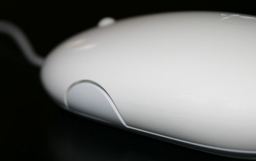
Last up are the new side buttons on the Mighty Mouse, the buttons that for me are the worst design element of Apple's mouse. Although there is one button on each side of the Mighty Mouse, they need to be depressed together in order for them to activate and operate, which means that the two buttons only really act as one.

One of the two side buttons


45 Comments
View All Comments
kelmon - Friday, August 5, 2005 - link
Great article. I'm pretty interested in one of these mice as my current MS IntelliMouse is getting a little long-in-the-tooth and could best be used with my old PC these days. Since I'm going to be in London in a couple of weeks I'll stop in at the Apple Store there and see if I can play with one for a bit. Gaming isn't something that I do very much these days so that aspect shouldn't be a problem, so if it feels comfortable and the scrollball works well for me then I'll probably buy one (assuming that I can persuade the wife...).Anyway, a great summary of the features and it definitely highlights the need to "try before you buy".
jkostans - Friday, August 5, 2005 - link
What I got from this article: The mouse sucks, but we don't want to offend the mac people so we'll be very very nice about saying it. I have no idea why anyone would buy this after seeing this or any other review on the web.jazzcrazed - Friday, August 5, 2005 - link
Well, it's important to know that the prospective users of this mouse are not reserved to users of multi-button mouses, but also users of the one-button Apple Pro Mouse - which are, believe it or not, the majority of Mac users. Us PC users who've all our lives used multi-button mouses most certainly do not know the perspective of someone who's exclusively used one-button mouses. Anand emphasized his subjectivity on this matter, and rightly conceded that in many cases he could not speak universally on certain features. He wasn't writing this review just for PC users, but Apple Pro Mouse+Mac users.For what it's worth, I think it's definitely a more scrutinizing review than <a href="http://arstechnica.com/reviews/hardware/mightymous...">http://arstechnica.com/reviews/hardware/mightymous... Cheng's at Ars Technica</a>.
Griswold - Friday, August 5, 2005 - link
Why is Apple going to extreme lengths to be different and sacrifices usability for that? Are they afraid of being compared to (superior) products and thus hide behind fancy gimmicks nobody really needs or wants?fishbits - Friday, August 5, 2005 - link
I was asking the same thing myself. The basic three-button mouse with scroll wheel works fabulously, and if you can't improve on that or even come close, don't bother. But that's the weird cultish power of Apple. Because it's different it must be better, and because it's Apple it must be better. Even when it isn't.Even Anand falls for it to some degree. Cracked up reading his lapse into battered wife syndrome:
"It's my own fault, I brought it on myself!" A PC user buys a crappy mouse and says "This thing is a piece of junk," throws it out and buys one that works right. An Apple user buys a crappy Mighty Mouse and says "There must be something wrong with ME!" Too funny.
Backslider - Friday, August 5, 2005 - link
My thougths exactly, WHY! Just make it two buttons and be normal. I wonder how much money they spent in engineering this stupid gimicky crap. If I was an investor I would be pulling all my stock out today.Davediego - Friday, August 5, 2005 - link
You mentioned you wished other mice had horizontal scrolling... well your mx1000 does. The scroll wheel titls to the side.Dennis Travis - Friday, August 5, 2005 - link
If you read farther down Anand states his MX1000 has horizontal scrolling.radonX3 - Friday, August 5, 2005 - link
I don't understand the logic of Apple. Everything they make are flashy toys with no real functionality behind it. This mighty mouse is another example of it.Hywel - Monday, August 8, 2005 - link
I think you're wrong here. "Everything they make are flashy toys with no real functionality behind it", is just plain wrong. It's a common accusation that Apple are all form over function, but it just ain't true. The majority of Apple product offer form and function.However, in this particular case, the stupidly named Mighty Mouse, Apple have produced a lemon. For all the reasons the review mentions. For the 'battered wife' syndrome mentioned in a comment below, and probably a whole lot more.
I've been thinking about getting a multi-button mouse for a while, but it's not been a priority. Unlike a lot of Mac people, I think properly designed context sensitive menus are fabulous - as long at they're contextual, and not just a bunch of unrelated crap. So I was ready to jump on this thing. Given two products that are essentially equal, I'd go for the Apple one, even if it was a few quid more. Simply because they usually make good stuff that's easy to use. I'm not buying this thing though. I've thought about it, and I think this review is being a bit soft on Apple. This mouse is over-engineered. It solves a problem of Apple's own invention: "Make a two button mouse with no apparent buttons", when the real job spec should have been "Make a bloody good comfortable multi-button mouse that's better than anything from Logitech or Microsoft".
The mighty mouse is crap.