Sharpening
If you didn't know already, one of the best sharpening tools available in Photoshop and Elements is called Unsharp Mask (under the Filter\Sharpen menu). It should always be one of the very last things that you do to an image after editing and resizing. Because sharpening is such an important part of making a good image look great, we are going to give you some basic input boundaries for the Unsharp Mask (USM) dialog. Also, because we often see over-sharpened images on the web, we are going to provide some examples of what over-sharpened images look like.
First off, do all your exposure adjustments, color correction, etc. Resize your image for whatever application for which you intend the image to be used. Our example below is going to be used for the web, so we have resized it to 535x800 pixels (the thumbnail is 300x449 pixels).
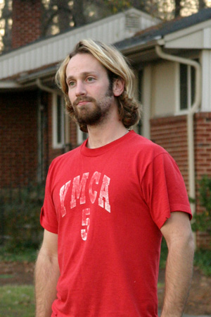
Original image
Click to enlarge.
1) Set your image magnification to Actual Pixels. To do this, double-click on the Zoom tool in the tools palette. This is very important so that you can see the effect on your image as you adjust the parameters.
2) Open up the USM dialog by going into the Filter\Sharpen menu.
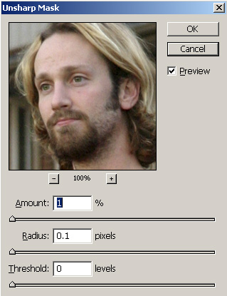
PUSM dialog
You'll see three adjustment sliders: Amount, Radius, and Threshold. Unfortunately, there's no way for us to tell you what to put in these fields. The best settings will depend on the detail in the photo, original sharpness, and your subjective sharpness tolerance. However, we can tell you what the adjustments will do. Think of the Amount slider as a gain control; it will determine how much sharpening to apply. Since Unsharp Mask is essentially sharpening the edges in your image, the Radius will determine how many pixels from the edge to sharpen. Finally, think of the Threshold as a tolerance slider. If the Threshold is lower, more pixels will be considered part of the edge. If the Threshold is higher, fewer pixels will be considered part of the edge. In other words, a higher Threshold will result in less sharpening. Now, let's look at a real example.
3) In the image below, we indicated a moderate Amount of 150%. By choosing a Radius of 1, we were able to bring some definition into the eyes. For the Threshold, we specified 4 to keep the background grain from being sharpened too much.<
Click to download sharpened image.

(Amount 150%, Radius 1, Threshold 4)
Hold mouse over image.
Now, let's take a look at what would happen if we changed the Radius to 2 instead of 1 while keeping the other settings the same. Roll your mouse over the image below to see the difference.
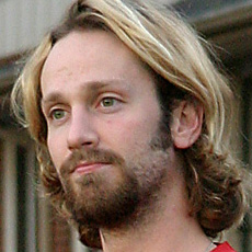
(Amount 150%, Radius 2, Threshold 4)
Hold mouse over image.
Notice how we start to lose detail in the hair and eyes as the contrast increases dramatically. By setting the Radius too high, we have introduced what are known as halos to our edges. As a general rule, you should use a Radius of 1 or so along with a Threshold of 4 or more when you are looking for a softer effect on images with considerable detail. We should also point out that when printing an image, you can get away with much more sharpening in general than when viewing an image on a monitor. We highly suggest experimenting with different sharpness settings and compare the differences when they are printed on a high quality printer.
When you want to sharpen an image with a lot of fine detail, you will want to lower the Radius and Threshold. We do this all the time when we sharpen our product photos. Hold your mouse over the image below to see the difference.
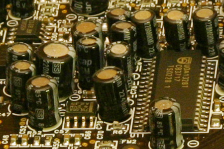
(Amount 255%, Radius 0.5, Threshold 6)
Hold mouse over image.
By selecting a Radius of 0.5, we were able to sharpen the fine details of this sound card. When using lower Threshold amounts, you have to be very careful about over-sharpening the grain (noise). In the example above, we selected a Threshold of 6, which allowed us to avoid sharpening any unnecessary noise.
To demonstrate why it is important to set a low Radius for images with fine detail, we kept the Amount and Threshold settings the same while boosting the Radius to 2. Hold your mouse over the example below to see what happens.
(Amount 255%, Radius 2, Threshold 6)
Hold mouse over image.
As you can see, with a Radius of 2, we start to lose significant detail to halos at the edges. The only way to become experienced with Unsharp Mask is to experiment with it until you know what works for different types of images. As we said before, images destined for print can be sharpened more than images for the screen or web. Just create some samples and compare the printed results.


20 Comments
View All Comments
vladik007 - Saturday, March 19, 2005 - link
if you're such a hot shot photographer , read dpreview's articles and subscribe to magazine that are FOR pros. This is a sire for hardware geeks , so this little tid bit is great and refreshing.Power to anand and his editors , great job.
vladik007 - Saturday, March 19, 2005 - link
hoppa - Saturday, March 19, 2005 - link
In Soviet Russia, layers adjust YOU.JarredWalton - Friday, March 18, 2005 - link
Great stuff, Stephen. Now all I need is a way to make the crappy, grainy images from my digital camera not look crappy and grainy. (Note to others: The Fuji S5000 shoots *only* in ISO200 or ISO400 modes. So, my options are "grainy" and "really grainy". I'm going to see if I can pick up some halogen lights tonight and maybe they'll help.)CrystalBay - Friday, March 18, 2005 - link
thanks for the toot..blackbrrd - Friday, March 18, 2005 - link
Nice article!More articles like this is good :)
(Don't go the tomshardware way.. 80% of the articles there are useless)
segagenesis - Friday, March 18, 2005 - link
#2 - Wah wah... this is a good article, would you rather have your pictures look like mud?Rocket321 - Friday, March 18, 2005 - link
I found this information very useful and hope to see more photo guides in the future. As an amature this type of infomation is invaluble.Questar - Friday, March 18, 2005 - link
Typical amatuer stuff, adding way too much contrast and color saturation to punch up images.InuYasha - Friday, March 18, 2005 - link
power of phtoshop!