AnandTech Guide to Better Photos: Post-Processing
by Stephen Caston on March 18, 2005 3:45 PM EST- Posted in
- Digital Camera
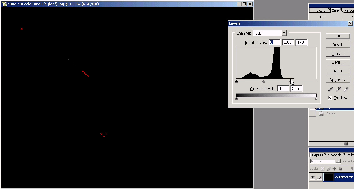
Levels
Almost every photo can benefit from a levels adjustment. We are going to show you some examples that demonstrate how a levels adjustment can bring life back into your photos. This is particularly effective for images that are too dark. The levels command in Photoshop and Elements allows you to remap the brightness levels in a photo resulting in a high contrast image.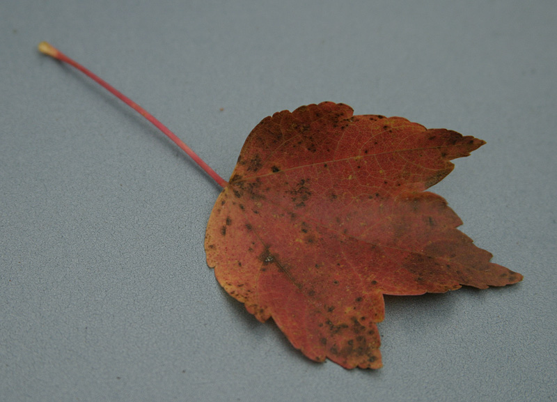
Original image
Click to enlarge.
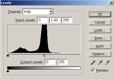
1) Open the Levels dialog by pressing Ctrl-M (Mac: Command-M). Again, you could just as easily use a Levels Adjustment Layer if you think that you might want to alter it later. The first thing that you will see is a histogram. A histogram displays the brightness of an image starting with the darkest information on the left to the brightest information on the right.
2) Click on the black slider on the left directly under the histogram (circled in red below). Slowly drag the slider to the right.
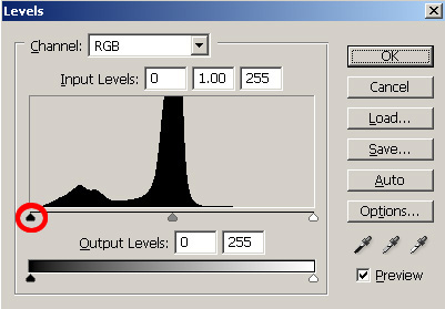
Dragging the black slider to the right while holding “Alt”
Click to enlarge.
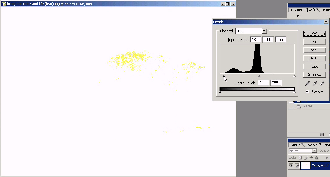
Now, use the same technique to drag the white slider to the left and stop just before clipping any color channels. You should already see a tremendous difference if your photo is anything like ours.
Dragging the white slider to the left while holding “Alt”
Click to enlarge.
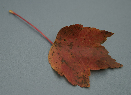
Here are the results that we achieved by simply adjusting the black and white sliders:
| Original image |
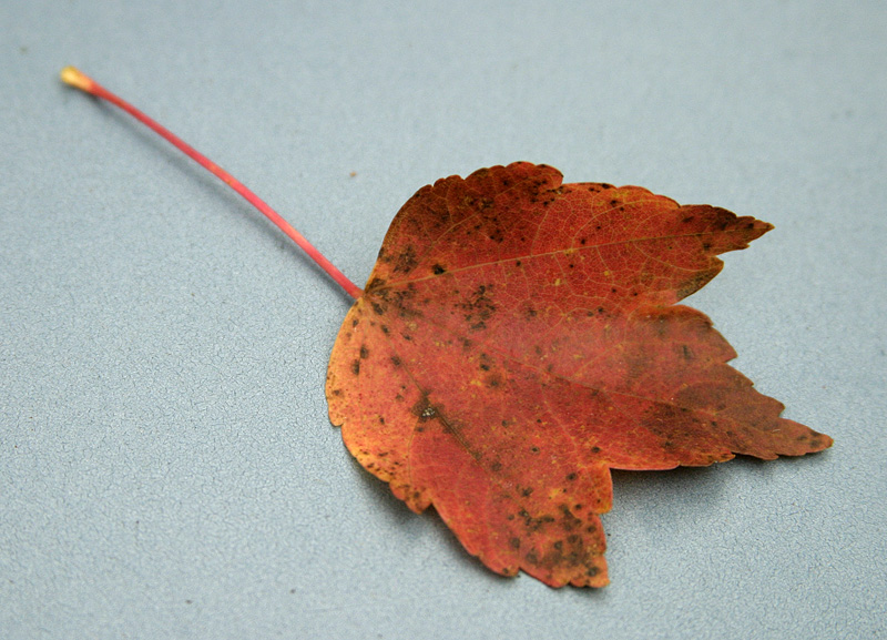 Image after levels adjustment |
| Click on above images to enlarge. | |
 Original histogram |
 Histogram after levels adjustment |
You can clearly see how we’ve “stretched” the histogram to cover more of the brightness range. This has increased the contrast and given the photo more “pop”. Below is a final comparison where we pulled the white slider just a bit further to the left. Although this causes some slight color clipping, it is hardly noticeable and the effect is just what we wanted.
Hold mouse over image.
Hold mouse over image.


20 Comments
View All Comments
vladik007 - Saturday, March 19, 2005 - link
if you're such a hot shot photographer , read dpreview's articles and subscribe to magazine that are FOR pros. This is a sire for hardware geeks , so this little tid bit is great and refreshing.Power to anand and his editors , great job.
vladik007 - Saturday, March 19, 2005 - link
hoppa - Saturday, March 19, 2005 - link
In Soviet Russia, layers adjust YOU.JarredWalton - Friday, March 18, 2005 - link
Great stuff, Stephen. Now all I need is a way to make the crappy, grainy images from my digital camera not look crappy and grainy. (Note to others: The Fuji S5000 shoots *only* in ISO200 or ISO400 modes. So, my options are "grainy" and "really grainy". I'm going to see if I can pick up some halogen lights tonight and maybe they'll help.)CrystalBay - Friday, March 18, 2005 - link
thanks for the toot..blackbrrd - Friday, March 18, 2005 - link
Nice article!More articles like this is good :)
(Don't go the tomshardware way.. 80% of the articles there are useless)
segagenesis - Friday, March 18, 2005 - link
#2 - Wah wah... this is a good article, would you rather have your pictures look like mud?Rocket321 - Friday, March 18, 2005 - link
I found this information very useful and hope to see more photo guides in the future. As an amature this type of infomation is invaluble.Questar - Friday, March 18, 2005 - link
Typical amatuer stuff, adding way too much contrast and color saturation to punch up images.InuYasha - Friday, March 18, 2005 - link
power of phtoshop!